Visual Identity: Logo Design
For over 45 years, the North Island Festival of Performing Arts (NIFPA) has been committed to producing an annual educational festival where distinguished adjudicators provide feedback and recognize excellence in young perfomers. They aim to promote and ignite a greater love for the perforoming arts.
The festival has evolved over the years, but their visual identity had not. The visual identity needed to reflect the festival’s ethos of education and celebration of creativity.
Design Process
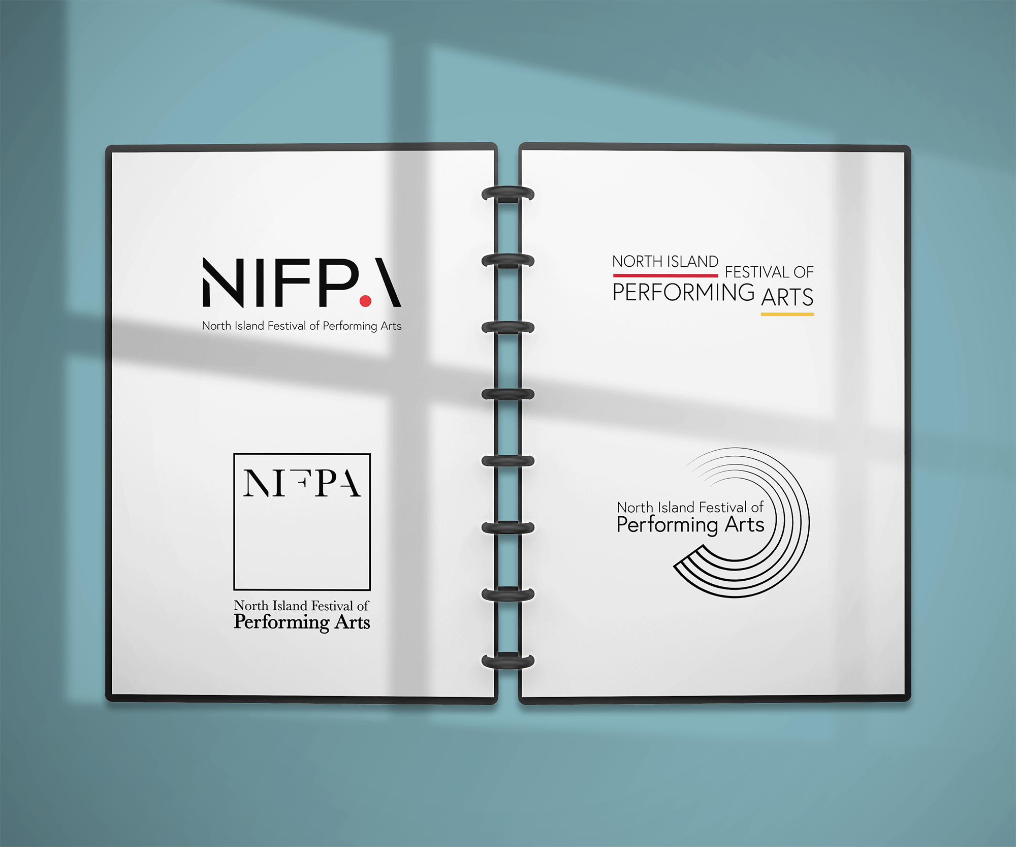
The logo above is the original logo for NIFPA. Here, early concepts for the updated logo are shown. Four distinct design options were conceptualized; each design aiming to align with the client’s vision of timelessness and versatility.

Process Notes
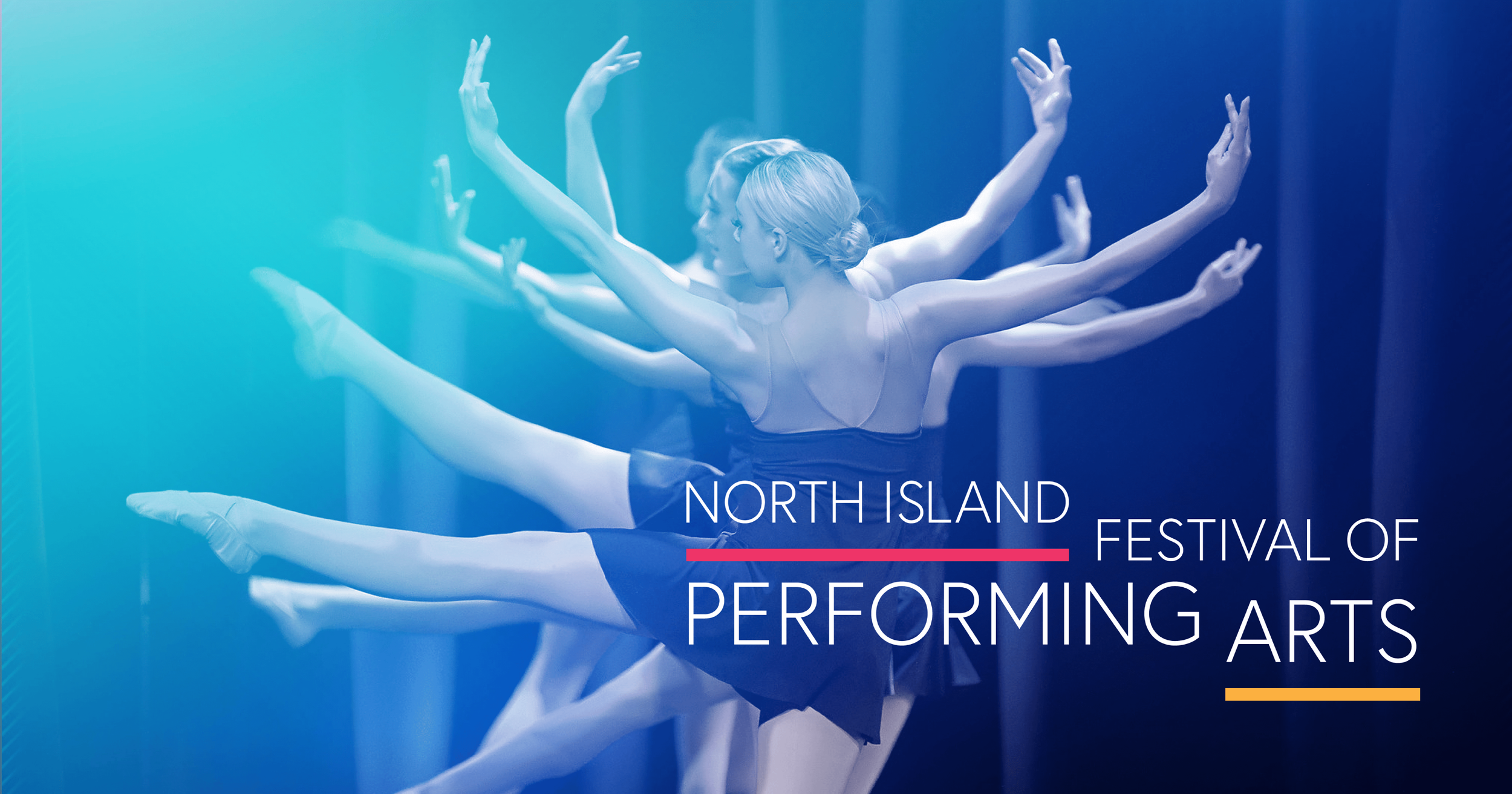
While NIFPA has focused dance in recent years, they plan to return to hosting competiotions in vocals and instruments in upcoming seasons. This desire to expand the festival necessitated a flexible logo that remains impactful and recognizable whether overlaid on imagery featuring dancers, vocal recitals, or instrumental showcases.
To maintain a modern and timeless aesthetic, a clean sans-serif font, bold colours and geometric, balanced shapes were used. The simplicity of the typography enhances readability and allows the logo to adapt seamlessly across various applications.

The final logo family is distinct and versatile, embodying the spirit of the North Island Festival of Performing Arts with grace and sophistication.